Executive dashboards are a critical Experience Management (XM) tool as they provide senior leaders with easy visibility into the progress and impact of the organisation’s customer or employee experience efforts. When designed well, these dashboards allow executives to surface areas of risk and opportunity, track leading indicators of future financial performance, and prioritise their investments.
Given their limited time, however, executives need dashboards that quickly convey key insights with the least amount of friction. They must be tailored to each senior leader’s individual needs and empower them to ask the right questions based on the data presented. A design that fails to deliver will see low adoption and inspire fewer experience improvement-based discussions with this essential stakeholder group. To maximise the effect of your XM executive dashboards, we recommend following an approach called Action-Centric Dashboard Design (ACDD), which refers to:
“The process of creating dashboards that are purpose-built to facilitate end users’ decisions and workflows.”
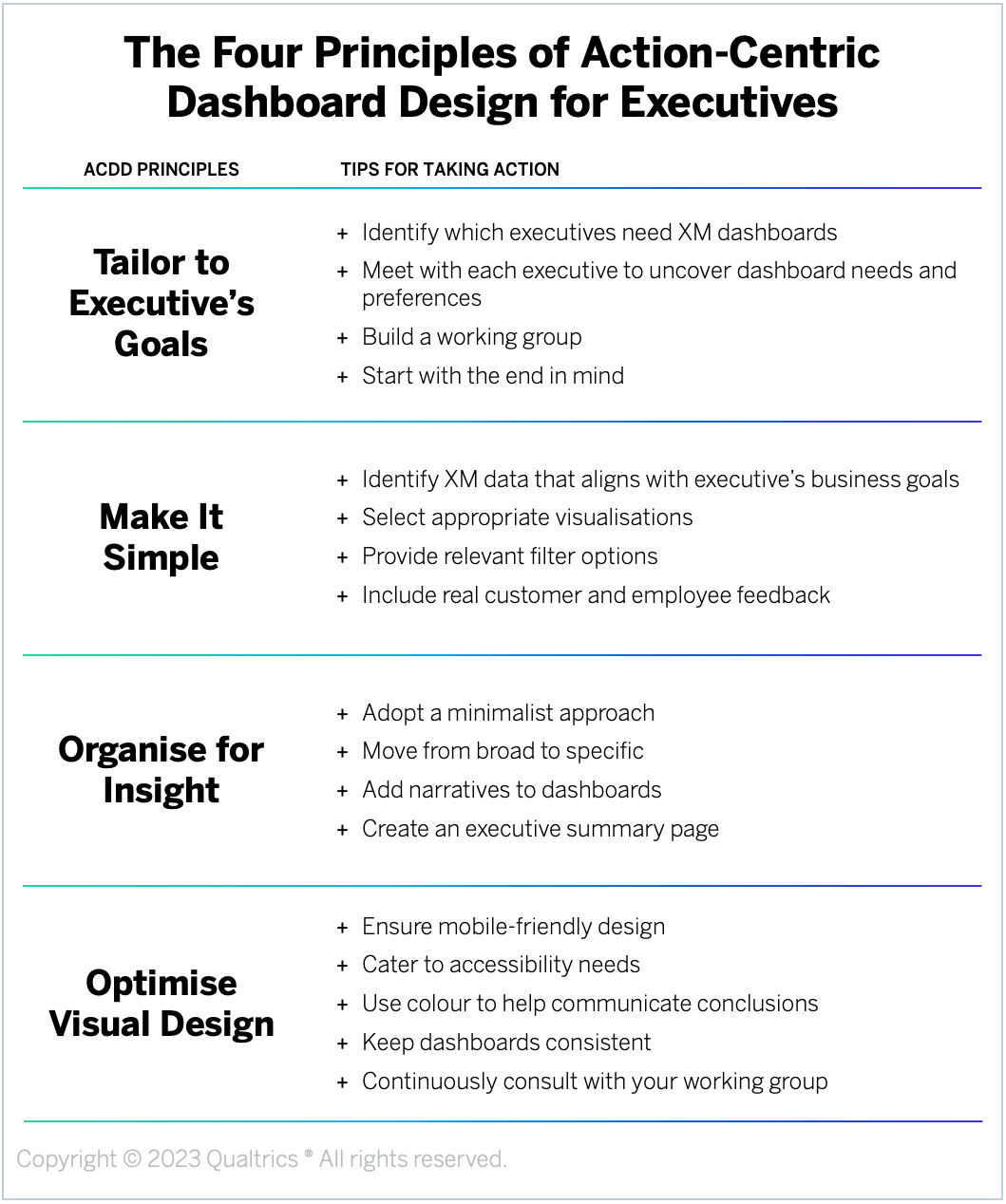
There are four principles of ACDD, which can be specifically applied to develop effective executive-level dashboards:
- Tailor to Executive’s Goals: Customise dashboard design for each executive to ensure value and drive adoption.
- Make it Simple: Identify and include only information that is essential for that executive’s success.
- Organise for Insight: Display information in a way that naturally focuses the executive’s attention on the most important and actionable insights.
- Optimise Visual Design: Follow UX best practices to make it intuitive and easy for the executive to absorb the information.
Design Principle #1: Tailor to Executive’s Goals
Executives are the organisation’s visionaries – the ones responsible for painting a compelling picture of the future and then leading the business towards that desired end-state. To warrant the executive’s time, your dashboard needs to be tailored to support the big-picture strategic decisions that leader has to make within their role. To do that effectively, you first need to understand the specific goals, priorities, and metrics the executive cares about and is accountable for.
Here are some tips for tailoring the dashboard to each executive’s goals:
- Identify which executives need XM dashboards. While all executives have some role to play in improving the experiences the organisation delivers, not all of them will need a dashboard to check in on XM metrics regularly. Review the structure of your organisation and XM program to identify which leaders should be interested in monitoring customer or employee experience data through a dashboard. This might include executives like your CEO, COO, CMO, as well as Experience Management-specific leaders, such as a CHRO, CXO, VP of Customer Experience, or Head of People Analytics.
- Meet with each executive to uncover dashboard needs and preferences. Before you begin designing the dashboard, set up an introductory, one-on-one meeting with each executive you’ve identified – or, if that’s not feasible, with their top lieutenants – to understand their objectives, metrics, and roadmap. Take this time to quickly introduce the executive to the XM survey(s) that will be feeding their dashboard and ask questions like, “How much time do you expect to spend looking at the dashboard when you log in?” “What is your preferred viewing channel (e.g., desktop, mobile, tablet)?” and “What are some elements of other dashboards you like or don’t like?” Here you should also be asking specific questions about the data they need to be included, such as the XM metrics they are accountable for, business outcomes the dashboard will help them influence, the key drivers and other survey fields that are most important to them, filtering preferences, and whether they are interested in reading relevant open-ended comments.
- Build a working group. Creating an effective dashboard is an iterative process. However, securing regular check-ins with an executive to get feedback on the design can be difficult. Instead, try to identify individuals who report to the executive and are familiar with their thinking who can act as their representatives in the design process. In addition to these lieutenants, your working group should include relevant members of your CX or EX team as well as any data analysts who will be working to feed the right data into the eventual dashboard. You should bring this team together regularly to review and refine the proposed dashboard design.
- Start with the end in mind. After you’ve developed a deep understanding of the executive’s goals, priorities, and KPIs – but before you start the actual design process – take the time to articulate a narrative around the story you need the dashboard to convey. How will the page relate to the business operations the executive is responsible for? How will it furnish them with the insights they need to ask the right questions of the employees on their team? Starting with a clear idea of the end in mind will help ensure that the data you select and the visualisations you create all serve to provide the executive with the insights they need to make smarter strategic decisions.
Design Principle #2: Make it Simple
Executives have responsibility over large swaths of the organisation, which means the dashboards you create need to focus on breadth, not depth. Rather than overwhelming executives with unnecessary details, these dashboards should provide a quick temperature check – communicating things like overall XM performance, opportunities and weaknesses, and trajectory across business lines or client types. These dashboards should empower executives to ask the right questions to senior members of their team.
Here are some tips for making executive dashboards simple:
- Identify XM data that aligns with the executive’s business goals. Based on our experience, an executive is realistically only going to devote a maximum of three minutes per day to an XM dashboard. To maximise engagement and adoption, the dashboard needs to quickly and clearly tie XM metrics to the business outcomes that particular leader cares about, showcasing how improvements in experiences will positively influence things like revenue, retention, attrition, brand loyalty, etc. Use the information you collected about each executive’s goals and KPIs – along with feedback from their representatives – to identify which top-line XM metrics to include. These dashboards should also track key driver metrics that are collected in the same survey and explain the score of the overall metric, like trust in the organisation, agent helpfulness, manager effectiveness, or ease of completing a task. You may also want to include benchmarks and historical data to allow the executive to compare performance over time and against industry standards or competitors, which will help them identify trends and improvement opportunities. And because executives often need to make decisions quickly, make sure the data you’re including can be updated in real-time or near-real-time.
- Select appropriate visualisations. Once you’ve identified which data to include, choose widgets that will allow you to package up and communicate that data in a concise and compelling way. For example, top-line metrics are often displayed using a gauge chart, breakouts across different areas (e.g., customer tier, employee tenure, product line) are usually captured in column charts, and trends over time are shown in line charts. Add in arrows, reference lines, colours, or text to remind the executive what the goal is for each metric and how you are performing or trending against those goals. Each visualisation should be titled in a way that intuitively communicates to the executive what information is shown. For more complex visualisations, include descriptions or description icons to explain how the information should be interpreted.
- Provide relevant filter options. Unlike business leaders of specific functions, executives should have access to the full set of data you’ve collected. However, if you try to capture all that data on a single dashboard, you will end up with an overcrowded, impenetrable jumble of insights that the executive will likely end up ignoring. Instead, while all the information you present should, by default, reflect the entire respondent base, include filtering options that the executive can use to drill down into the details. Filters should reflect the questions they are most interested in – like how results differ by segment, product, or region – and help them quickly identify the root causes of XM issues. To avoid overwhelming the executive with too many options, collaborate with your working group to identify which filters will be most relevant for them.
- Include real customer and employee feedback. Humanise the data you include in the dashboard by incorporating real customer or employee feedback. This could take the form of a response ticker showing open-ended survey responses along with other relevant fields like their name, segment, and relationship score. It could also include the results of topic and sentiment analysis, highlighting areas of pain or frustration, or even include video or audio files of people talking about their experiences. This rich feedback will not only better engage an executive’s empathy, it can also neatly explain the “why” behind the number and inspire faster action and more interactivity with the dashboard.
Design Principle #3: Organise for Insight
Once you know which data to include and how to visualise it in a widget, you then need to decide how to organise the information on the dashboard page. The information should be laid out in a logical way that tells a clear story about relevant XM trends and patterns. Each data visualisation should make sense both on its own and in relation to the visualisations around it.
Here are some tips for organising your executive dashboards for insight:
- Adopt a minimalist approach. If an executive has to hunt for information, they are unlikely to use the dashboard. Use simple layouts that are easy to interpret and refrain from adding more data or views without pruning existing information. We recommend a maximum of 10 visualisations on a given page. A good general principle is to make all metrics visible “above the fold,” so the executive doesn’t need to scroll down to find any information.
- Move from broad to specific. Adopt a funnel approach to communicating information. The funnel can move either vertically (top-to-bottom) or horizontally (left-to-right). If you are taking a vertical approach, place the most strategic metrics at the top of the page and then more targeted, specific widgets that break down those top-line numbers underneath. Usually, the top three most important, general metrics are shown first – often in slightly larger widgets that ensure they stand out. Below those high-level metrics should be the visualisations that show key drivers of those numbers, trends over time, and/or the metrics broken out by key segments. If you are taking a horizontal approach, arrange your dashboard with a single horizontal bar for each metric area, with the top-line metric on the left and then key drivers and trends – like performance year-to-date and a 90-day rolling timescale – to the right.
- Add narratives to dashboards. While it may seem counterintuitive, adding narratives to your dashboards can help proactively answer questions your executive would otherwise ask. When an executive knows you have reviewed the dashboard and added commentary around why they are seeing particular insights, it gives them the confidence to use the dashboards in the future, knowing they have context around things like current performance trends and shifts. We also recommend providing relevant contextual information alongside metrics (like the methodology behind NPS), adding notes on any significant changes in data trends, and highlighting customer or employee verbatims that bring particular scores to life.
- Create an executive summary page. Depending on the executive, your dashboard is likely to include several program-specific pages digging into the customer or employee experience data relevant to their area of interest. You should also create an executive summary page for all senior leaders that provides a snapshot of the overall state of the XM metrics your leadership team cares most about. This page – which will be the first page any executive sees when opening their dashboard – should focus on the topline relationship metrics your XM program is measured on, followed by a minimal number of breakouts of that score by relevant criteria, like employee engagement across departments or NPS across customer segments. Here you may also include key drivers of that topline metric to provide some clarity around why those scores are changing as well as a small number of filters the executives can use to further explore the data. Because this page is designed to be viewed by all executives, make sure you are only including information that is relevant to everyone.
Design Principle #4: Optimise Visual Design
Thanks to a cognitive quirk known as the “Fluency Heuristic,” people naturally ascribe more value to things that can be processed quickly and easily. So even if your dashboards present the right information in an easy-to-follow format, if they aren’t visually appealing, executives are less likely to trust the data you share. To maximise the impact of your dashboards, make sure you are creating an on-brand, professional look and feel by following user experience (UX) design best practices.
Here are some tips for optimising the visual design of your executive dashboards:
- Ensure mobile-friendly design. Executives are often away from their desks and will likely want to be able to access this data on the go. Make sure the XM dashboard you create looks good and is easy to navigate across all devices, including phones and tablets. If you are designing for an executive who primarily expects to view the dashboard on their mobile device (as uncovered during your initial meeting), it is essential that the dashboard has simple visualisations, renders easily on a smaller screen or app, and doesn’t have too many technical features, like complex filters, or rely on interactivity, like information that appears when you hover over it. Instead, opt for things like simple one-click filters and clearly displaying the numbers on your visualisations. Remember that each added technical function adds a small but significant level of friction, placing an additional barrier between the executive and their desired view. Test the design on mobile devices regularly to confirm that what you’re building for desktop works just as well on a smaller screen.
- Cater to accessibility needs. Dashboard designers often overlook individual accessibility needs. Ask the executive or their representatives if they have any specific needs you need to incorporate into your visual design. This might include considerations around background and text colouring, font size, dark mode, and use of patterns and colours in visuals. Tables, row colouring, number formatting, and simple tooltips can help make the reading experience much easier. Also, be sure to include enough white space both within and between your widgets as it will make consuming the information less taxing on the executive, especially on smaller devices. Another element to think about here is how technologically savvy the executive is. While most executives will have a good level of IT capability, people only become proficient with a system when they use it on a regular basis. Given how little time executives tend to spend on any one platform, their familiarity is often lower than other users.
- Use colour to help communicate conclusions. There are a number of ways to use colour across your XM dashboards to help executives draw quick, accurate conclusions from the data. You can use it to denote the same categories across different visualisations, such as the same colour for each product across the different widgets. You can also use pops of colour to call out certain findings or segments that warrant attention. Just make sure the colour schemes you use don’t accidentally cause executives to draw the wrong conclusions. For example, we only recommend using red and green as colours in the dashboard when you are depicting something with a natural positive and negative interpretation, like Detractors and Promoters. The colours you choose should also match your organisation’s brand to ensure the dashboard looks official.
- Keep dashboards consistent. If you’re designing a dashboard with multiple pages, it’s important to use a consistent structure on each page. This includes locating things in the same places and using the same type of visualisations when you’re presenting the same metric in different places. For example, if you’ve placed a gauge chart that depicts an overall metric in the upper-left-hand corner of one page, you should use that same setup on other pages. This will allow the executive to become more comfortable viewing the dashboard and will make it easier for them to acquaint themselves with future pages you create.
- Continuously consult with your working group. Again, dashboard design is an iterative process. As you make decisions about which data to include and how to present the information, continuously check in with your working group for feedback. For your first iteration, you may want to consider creating two versions of the dashboard, each of which meets the needs of the executive but communicates the information in different ways. Giving the working group two options to compare often leads to better, more actionable feedback compared to showing just a single option. Take the time to dig into each widget individually to make sure it clearly communicates its intended message.
Apply the Principles: Mobilising Executives Around Your Dashboards
At the end of the day, it doesn’t matter how well-designed your dashboard is if the executive doesn’t use it to influence their decisions and activities. Once you have developed the dashboard, you then need to equip leaders with the information and support they need to – not only use the dashboard effectively – but integrate it into their normal operating routine. They should be accessing the dashboard on a regular basis and consulting it whenever they need to make an important decision.
Here are some tips for mobilising executives around your dashboards:
- Hold a launch meeting. Once the dashboard is up and running, set up a face-to-face meeting with the executive. We strongly recommend holding this meeting in person, if possible, so you can physically walk them through the process of logging on and engaging with the dashboard. This might also include downloading the app or bookmarking the page on their desktop. The executive should leave the meeting with a clear understanding of how to access and interact with the dashboard, how to incorporate checking the dashboard into their operating cadence, and where they should go for help. Immediately following this meeting, send the executive a follow-up email reiterating the purpose of the dashboard as well as simple instructions on how to log in and what to do if they encounter a problem.
- Send complementary communications. While the ultimate goal is to have an executive actively visiting the dashboard as part of their own routine, they may need prompting – especially early on. Create an automated email that sends at a set time each day or each week and lifts top-level highlights from your dashboard and delivers them into the executive’s inbox. This will often be enough to engage their interest and draw them in to view the full dashboard. Many executives hold a certain amount of time every day to review the information they need for the day ahead, so ask your executive when they would like the email delivered to coincide with that time. In addition to encouraging executives to check the dashboard regularly, you should also set up notifications to alert executives of any notable changes or issues that they may need to take action on.
- Discourage off-platform reporting. Many executives will default to asking for information to be fed to them manually, such as through reports built in Excel or snipped into Powerpoint. While this might be familiar, this kind of static reporting does not help them receive the type of timely XM insights that should inform their everyday decisions. Avoid extracting detailed information that is easily visible on your dashboards, as it will make the executive reliant on you – rather than on the dashboards – and delay the realisation of actions.
- Use the dashboard every time you meet with the executive. The dashboards you create should play an active role in physical meetings. In place of slide decks, you can use XM dashboards live in meetings to encourage executive adoption and show them how the conclusions you’re drawing are related to the information displayed on the page. This will demonstrate effective dashboard use – not to mention cut down on your preparation time! If you don’t already have a standing meeting scheduled with each executive, try to get one on the calendar. Regular review meetings will give the leader a reason to purposefully review the dashboard and drive deeper discussions around longer-range insight predictions.
The bottom line: Follow the four principles of ACDD to create dashboards that will engage executives and prompt more XM-centric decisions and activities.
James Scutt, XMP, is an XM Catalyst with the Qualtrics XM Institute
Isabelle Zdatny, XMP, CCXP is an XM Catalyst with the Qualtrics XM Institute