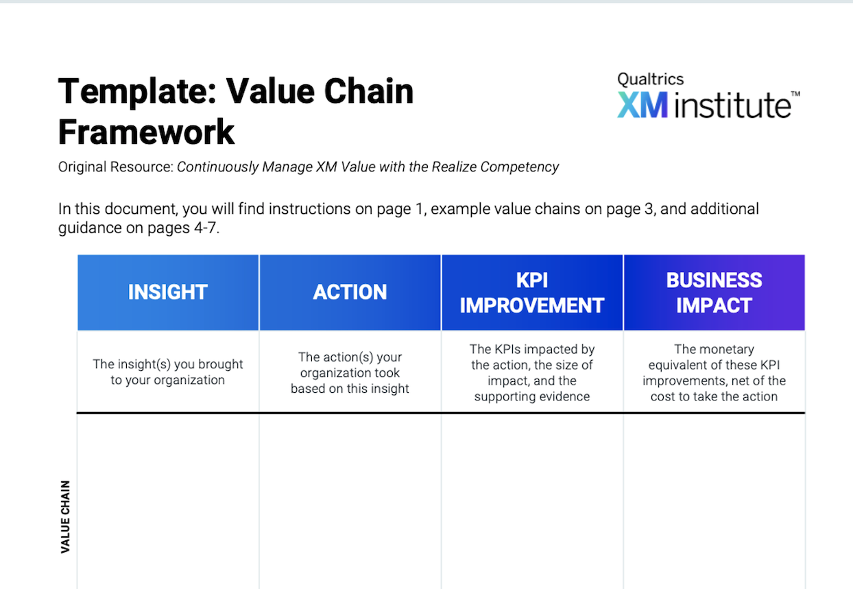
Great customer experience (CX) programs make and facilitate data-driven decisions throughout an organization. When done well, dashboards play an essential role in supporting these decisions, helping end users across organizations both understand and respond to customers’ experiences by allowing them to dynamically intervene to improve both CX and business outcomes. However, dashboard creators today often design these dashboards in ways that hinder, rather than facilitate, these types of activities, assembling the data and widgets in a haphazard way that makes it difficult to decipher key insights.
While critiques of the dashboard as a method of communicating results abound, the dashboard can still be a very effective way to share insights. Rather than creating dashboards to be deployed as compulsory reports or a static compendium of data, XM professionals should ensure they are designed with a purpose: to help end users do their jobs more efficiently and successfully. We call this approach, Action-Centric Dashboard Design (ACDD), which we define as:
“The process of creating dashboards that are purpose-built to facilitate end users’ decisions and workflows.”
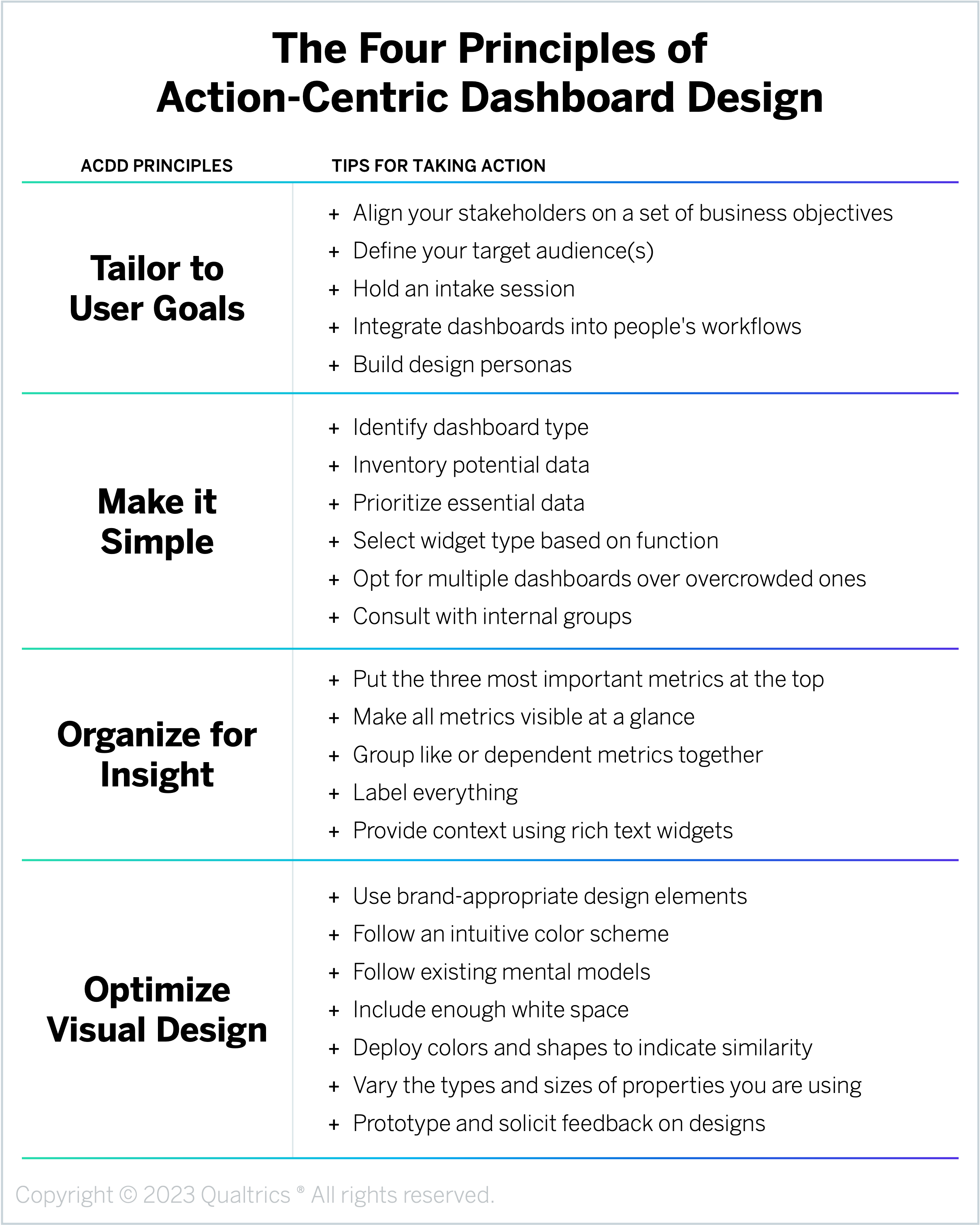
We’ve identified four principles for ACDD:
- Tailor to User Goals: Customize dashboard design by role to ensure value and drive adoption.
- Make it Simple: Identify and include only information that is essential for end-user success.
- Organize for Insight: Display information in a way that naturally focuses end users on the most important and actionable insights.
- Optimize Visual Design: Follow UX design best practices to make it intuitive and easy for end users to absorb information.
Design Principle #1: Tailor to User Goals
What qualifies as an “effective” dashboard is entirely within the eye of the beholder – or, in this case – the end user of the dashboard. Consequently, the design of any dashboard must always start with a deep understanding of the people who will be using it. Grounding your dashboards in a deep understanding of your audience, and ideally even more specific roles within that audience, will help you dial into the right level of detail and include the overall measures that matter most to each group.
To follow this principle, customize the dashboard design by role to ensure value and drive adoption. Here are some tips for tailoring your dashboards to user goals:
- Align your stakeholders on a set of business objectives. The universe of potential data you could include in your dashboard likely far exceeds the space available. Start the design process by defining a specific set of business objectives for your dashboards, such as reducing attrition, decreasing cost-to-serve, upselling/cross-selling products, increasing renewal rates, etc. Identifying these high-level objectives – which should relate to both the dashboard end user’s individual KPIs as well as the organization’s strategic and financial goals – will give everyone involved in the dashboard development process a clear north star goal to align around and prioritize against. To identify these objectives, ask dashboard end users and relevant business leaders questions like, “Which data will all roles need to see to drive alignment?” and “What is only interesting for the people in a specific role?” If this data is not available, consider pausing dashboard development until you can collect it.
- Define your target audience(s). Based on your specific goals, determine how many different dashboards you will need to create and for which specific roles (e.g., frontline, middle managers, account teams, executives, business owners). The exact number of distinct roles you will be designing for may depend on the size of your organization, the nature of your industry, and the CX governance model you have in place. Partner with the leaders of each business area to ensure that the dashboard users are prepared to use the tool and act on the insights.
- Hold an intake session. Once you know which roles you will be creating dashboards for, host an initial intake session with real stakeholders in those positions. The goal of this session is to develop a deep understanding of these specific end users – what are their needs, preferences, goals, processes, metrics, business tools, etc.? Questions we recommend asking here include things like, “What’s your role?” “What metrics are you measured on?” “Do any of them depend on customer-facing activity, if so, which ones?” “What are the top five things you wish you knew about each of our customers?” “What information would allow you to act on behalf of your customers at the right time?” By the end of the session, you should have much deeper clarity about the fields that you will want to display on each role-specific dashboard.
- Integrate dashboards into people’s workflows. The harder it is for users to access your dashboard, the less likely they will be to check it regularly. Early on, identify the systems or applications people within each role use as part of their everyday work and then embed access to your dashboards in those tools. The goal here is to get them into the dashboards with the fewest number of clicks, rather than adding to the preponderance of windows already open on their desktop. For example, if you’re building a dashboard for a customer service representative, you may want to make it easily available directly from Salesforce.
- Build design personas. To document and communicate the unique requirements and activities of each role, you may want to develop design personas for your different target audiences. Because these personas capture the underlying needs, desires, motivations, and goals of the humans using the dashboards, they will not only help you create effective dashboards in the near term, but they are also valuable assets in the long term if and when you need to redesign a particular dashboard in response to changing business needs or priorities.
Design Principle #2: Make it Simple
In many ways, designing a CX dashboard is similar to designing a dashboard in a car. In both instances, the dashboard user is limited in how much time and attention they can dedicate to reading the dashboard; they just need the minimum amount of information necessary to get them to their end goal as quickly and smoothly as possible. Less is more! Any additional information is likely to undermine the actionability of the dashboard, distracting the user from critical insights or causing them to ignore the dashboard entirely.
To follow this principle, identify and include only information that is essential for end-user success. Here are some tips for making your dashboards simple:
- Identify dashboard type. There are several different kinds of dashboards you could create, and the type of dashboard you choose will define the content you include. Which exact one you develop will depend on the end goals you identified in the previous section, but some examples include a Health Dashboard (which recaps your respondent funnel, with surveys sent, started, and completed), a Performance Tracking Dashboard (which shows a line graph with CSAT by month that filters based on the line selected), a CX Analysis Dashboard (which contains widgets using the same visualization for differently performing customer segments or page level filters that drive interactivity), and an XM Initiatives Dashboard (which tracks sentiment before and after an initiative is deployed on behalf of your customers).
- Inventory potential data. Now that you know who the dashboard is for and what type of dashboard you are building, it’s time to identify all the potential data you could incorporate. Start by inventorying the relevant experience and operational data, including any business KPIs you wish to display. Make this initial list as comprehensive as possible while assuring the data is accurate and available for the dashboards. This list of X- and O-data (commonly referred to as a “data map” or “data dictionary”) not only serves as a reference guide as you build these dashboards, but it also provides a one-stop-shop you can share when stakeholders ask if a particular metric can or should be included at some point in the future.
- Prioritize essential data. Once you have inventoried and organized all the potential data you could include in the dashboard, it’s time to determine which information you should include. Evaluate your data dictionary and decide, based on factors like the needs of your dashboard users, the type of dashboard, and your list of potential data options, which data is indispensable for the end user to see. Start with only the data fields you identified in the intake session and then be conservative about the number of data points you add. Including too much information is the biggest dashboard faux pas, so eschew any “nice to have” metrics in favor of “need to have” metrics. Your data dictionary can organize fields that do not make the cut into a “parking lot,” and if you find users are clamoring for that information, you can add them to the production version later.
- Select widget type based on function. Even if you select the right data to include in the dashboard, if it is presented in a complicated or confusing way, people won’t use it. Therefore, dashboard widget selection is not arbitrary. The goal of these visualizations is to be “cognitively invisible,” displaying information in a way that is easy to digest and act on. Content should blend with the form of your widget. If a stakeholder asks “What is this number telling me?” you have not achieved this balance. For example, you should use a bar graph or a waterfall chart to compare the relative proportions of segments, a line graph to display time series data, a scatterplot for correlation and distribution analysis, and a pie chart to show proportions in relationship to a larger population.
- Opt for multiple dashboards over overcrowded ones. If you pack too much information into a single, congested dashboard, users won’t be able to quickly access the insights they need and will either waste time searching or abandon the dashboard altogether. It is much better to build five individual dashboards than to include 50 widgets in one ever-scrolling compendium. If you do find yourself in a situation where you need to convey more information than can fit on a single dashboard, we recommend either building multiple dashboard pages or creating a static report. Unlike dashboards, which should only include mission-critical information, reports can be much more detailed and comprehensive.
- Consult with internal groups. Due to limited real estate, you may need to make some trade-offs or calculated decisions about what information to include on a given dashboard. Meet with people throughout your organization, including both end users and business owners, throughout the design process to ensure you are prioritizing and including the right information. The process of gathering consensus on each widget will drive excitement and help you make the cuts you need to make to drive best-in-class form and function.
Design Principle #3: Organize for Insight
Once you’ve selected which metrics to include in your dashboard and in what form, you then need to decide how you’re going to arrange that information in a way that’s easy and intuitive for users to understand. Rather than thinking of your dashboard as a grocery list, populated by discrete, disconnected units of information, you should instead think of it like a comic strip. Similar to a single frame in a comic book, each widget must tell a compelling story itself as well as work within the context of the broader narrative. Also like a comic strip, your dashboard should be organized to reflect the way people naturally consume information. For example, in English-speaking countries, where people read from left to right and top to bottom, place your widgets in priority order starting from the top-left corner.
To follow this principle, display information in a way that naturally focuses end users on the most important and actionable insights. Here are some tips for organizing your dashboards for insight:
- Put the three most important metrics at the top. Based on your initial intake sessions with users and the work you have done to simplify and prioritize, you should formalize a list of the top three most important metrics on any given dashboard. These are the most important metrics that everyone wants to see. So present those first! They should be easy to find and maybe larger than the other widgets.
- Make all metrics visible at a glance. Ideally, all the widgets you include in a dashboard should be visible “above the fold,” meaning a user shouldn’t have to scroll down the page to find any information. Forcing users to hunt for the widget they need will distract them from their actual work and dissuade them from leveraging the dashboard as a tool to make their jobs run more smoothly. Instead, try to set up your dashboard so that the person logging in sees a distinct tab with a page containing only the metrics they need to do their work better.
- Group like or dependent metrics together. Use the layout of the page to present each data element in context so it is clear how each widget relates to its neighbors. For example, rows should show data you would like to compare in some way, while columns should unite data across rows. If you present three equally sized widgets with the same visualization in a line, people will naturally read that as the “beginning,” “middle,” and “end” of an action. Keep in mind that people who speak languages that read left to right will scan a page in an F or Z pattern. Use this principle to place your metrics in a flow that helps users scan intuitively.
- Label everything. Numbers and graphs can be easily misinterpreted without explicit detail. Rather than forcing end users to guess what they are looking at, include clear descriptors and labels for each widget so they get a full picture of the data at a glance. For example, you may want to activate “turn on counts” or “provide statistical significance metrics” options to help the reader see the meaning behind the data element. Supplement the brief title of a dashboard widget with the exact wording of the survey item. The attention to detail here can make each widget its own independent moment as well as make it contextually relevant.
- Provide context using rich text widgets. In addition to the data widgets on your dashboard that show numbers and trends, you should also include “rich text editor” widgets that allow you to format and display static text on the screen. These types of widgets are particularly useful for adding insights, directions, support links, section titles, or other descriptive information. For example, you could use these rich text widgets to provide an executive summary at the very top of the page, to serve as “transition blocks” between data widgets, or to share static links to support pages or other feedback mechanisms. Capitalize on their formatting flexibility to vary the size and density of the fonts you are using throughout the dashboard to draw the user’s eye and prioritize where they should focus their attention. Just remember, if your text requires updating, set a reminder for accountability.
Design Principle #4: Optimize Visual Design
People naturally ascribe more value to things that can be processed quickly and easily, a cognitive quirk known as the “Fluency Heuristic.” Thanks to this heuristic, people will be more likely to use and trust your dashboards if they adhere to conventional user experience (UX) design principles and have a professional look and feel. Once you understand your target users and have identified what information you should include in the dashboard, you then need to drive clarity and action by designing dashboards with a professional style – examining every detail of the page to ensure it is functional, easy to understand, and enjoyable to use.
To follow this principle, follow UX design best practices to make it intuitive and easy for end users to absorb information. Here are some tips for optimizing the visual design of your dashboards:
- Use brand-appropriate design elements. Just as you would never send an external communication without a Marketing review to ensure the look and feel is “on-brand,” internal communication best aligns an organization when it looks official. Use the brand colors of your organization. Shade the background border to your main brand color, using the exact hex code where possible. Use space next to the title of the widget to show the most recent company logo, which should be in a rasterized format so it stays consistent as you resize it. In addition to colors, the typography, style, icons, and general design of the dashboard should be consistent with your organization’s branding elements.
- Follow an intuitive color scheme. Color is one of the most powerful tools in a dashboard designer’s toolkit. While the exact color scheme you use should match your organization’s brand, there are some general guidelines everyone should follow. For example, there should be high levels of color contrast for easy reading, use pops of color to highlight certain information or calls to action and use complementary colors for content (e.g., blue words in word clouds for “blue” brands). It is important to note that red and green often indicate negative and positive, and you may want to use that as a stylistic feature that drives content evaluation. However, always keep in mind that colors should be a secondary way of evaluating data because of its accessibility issues with those who may see color differently.
- Follow existing mental models. When users arrive on the dashboard page, they expect things to be located in particular places (e.g., a vertical navigation bar down the left side of the page, titles at the top of the widget card) and assume certain symbols will correspond to certain actions (e.g., three dots in the upper right corner of a card will expand into a menu of additional options, the blue text indicates a hyperlink). Violating these assumptions will unnecessarily disorient and confuse users, so whenever you are designing a dashboard, make sure you are effectively tapping into these mental models.
- Include enough white space. To avoid making your dashboard feel overcrowded and fussy, make sure you include adequate white space both within your widgets and between your widgets. Adding a cushion of negative space around information will provide users with some breathing room and create proximity that helps subtly group content together. To keep the UX design of the dashboard feeling spacious, do not add any unnecessary text or congested visualizations.
- Deploy colors and shapes to indicate similarity. The human eye naturally infers relationships between objects that look similar. When you are designing your dashboard, use similar characteristics – colors, shapes, chart types, fonts, icons, etc. – to denote similar types of content across widgets. For example, if your dashboard is tracking the performance of a set of products, use the same color for each product across the different widgets.
- Vary the types and sizes of properties you are using. While it is appropriate to replicate some display types (e.g., the three KPI widgets at the top tracking your topline metrics might all show a single number), readers have limited time, and seeing a similar format everywhere will make them “snow blind.” Vary the form of a widget to call attention to priority and content. Consciously apply display format to communicate relevance. Note that speedometers are large in comparison to a gas gauge, and an odometer is shown as a number, not a dial. The form matches the frequency and type of usage. The widgets you choose for your dashboards should be just as intuitive. For example, if “number of tickets resolved” is the most important metric for a Support Representative, that widget should be a large number, presented before any other widgets. Make your widget the entire width of the page if the data is particularly important or central to your enterprise.
- Prototype and solicit feedback on designs. Once you start building drafts of your dashboards, we recommend sharing and validating the designs with the same group of stakeholders – both end users and business owners – you’ve been partnering with throughout this process. Testing prototypes is essential as it will be much harder to change the way users think about the dashboard after you’ve rolled it out. Verify your wireframes with your primary stakeholders and internal teams and promptly eliminate any widgets that distract from their function or remit. Be sure to preview the dashboard on various screen sizes, especially mobile, to ensure that none of the widgets are displaying in a manner that distracts from the content.
Apply the Principles: Activating Your Dashboards
Following the principles of ACDD is the foundation for building highly useful dashboards. However, well-designed dashboards are not an end in and of themselves, actions are. Once you have built your dashboards, you then need to take specific steps to ensure that your target users are motivated to engage with them correctly. This relentless focus on facilitating customer-centric, data-driven actions should act as your polestar, informing everything you do, from dashboard inception to ongoing improvements. When this is done well, dashboards are transformed from data distribution mechanisms to an essential CX tool that unites all stakeholders around a common CX vision and enables them to make faster, smarter decisions within the course of their everyday roles.
Here are some tips for activating end users around your dashboards:
- Articulate how the dashboard helps makes CX better. People are naturally more motivated to change their behavior when they understand how their actions support a broader vision. So rather than just telling users to act on dashboard insights, explicitly tie their individual efforts to your organization’s wider CX mission. Publicize how the dashboard you have designed makes the customer experience better. It is important to create both internal communications to employees showcasing these customer-centric activities as well as customer-facing communications celebrating how these CX efforts have improved their experiences.
- Keep dashboards positive and helpful. The goal of dashboards is to help users do their job better, not to discourage or punish them for missing the mark. For example, you may choose not to include detractor comments in a contact center representative’s dashboard to avoid demoralizing them, but you may include such comments in a widget for a coach or manager. When a team or an individual uses a CX dashboard effectively to improve customers’ experiences, celebrate them with meaningful gestures of appreciation, such as public shout-outs, customer testimonials, or more formal awards and incentives. Highlighting these success stories will not only incentivize and reinforce desired dashboard behaviors but will also provide other users with ideas and inspiration for activities they can adopt themselves.
- Enable users to customize their own dashboards. Rather than trying to design dashboards that fit each individual user, train users on how to create or make adjustments to their dashboards where appropriate. Update the design or visualizations when an individual has a particularly useful idea. For example, if only your web designer is interested in the total number of pages viewed, you may want to reduce distractions for the broader team by removing total page views from the corporate view and just training that designer how to create that visualization for themselves.
- Use dashboards to test CX assumptions. A great dashboard that drives action is an analytic tool on its own. For example, it can help you formulate hypotheses that you can test for statistical significance. Filtering to the detractors on an NPS scale helps you to read comments only from those customers and discern a general theme in short order. However, keep in mind that while a dashboard can be useful as an analysis tool, it cannot replace an analyst. A dashboard can show you data and act as an effective “early warning indicator,” but it does not interpret your data for you. Bring in an analyst to test your hypotheses, answer questions raised by the dashboard, and illuminate the deeper relationships between data elements.
- Revisit dashboard design regularly. Dashboard design is not a one-and-done activity. To ensure your dashboard continues to drive the desired customer-centric actions, you need to review and update the design regularly. This includes activities like checking the usage of the page, deleting unused widgets, revisiting your initial assumptions around the types of visualizations you used to display data, and evaluating the success of the dashboard against your initial goals. We also recommend interviewing both users who are not using the dashboard to understand why they aren’t as well as interviewing users who are using it to understand what’s working well for them and solicit their ideas for potential improvements. It is unlikely that your dashboard will contain the perfect set of dials off the bat, so plan a set of ongoing iterations to ensure it is – and remains – a useful tool.
The bottom line: Follow four Action-Centric Dashboard Design (ACDD) principles to create dashboards that are relevant, easy to understand, enjoyable to use, and drive meaningful customer-centric improvements.