As part of our annual consumer studies, XM Institute asks respondents a series of questions related to Net Promoter Score* (NPS), a popular customer experience loyalty metric. In this infographic, we compile data from over 37,000 consumers to showcase our top NPS findings across different industries, age groups, and countries.
Check out this infographic to see how your NPS compares to the highest and lowest scoring industries as well as how your customers might answer this question differently depending on their demographic profile. Just remember, the goal of measuring NPS is not to produce a score, it’s to drive better decisions and improve customer experiences. For more information about how to evolve your own NPS program, check out our blog post, Advice For Propelling Your Net Promoter Score Program.
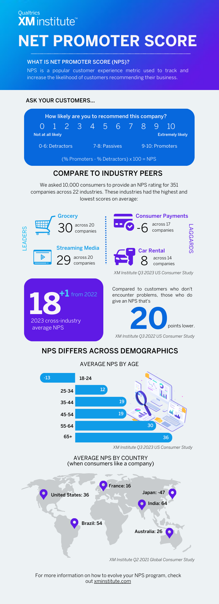
Here are the sources for the data shared in this infographic:
- 2023 Industry and Cross-Industry NPS: Qualtrics XM Institute Q3 2023 US Consumer Study
- Problems induce NPS 20 points lower: US Consumer Journeys Needing Improvement Across 22 Industries
- NPS by Age: Qualtrics XM Institute Q3 2023 US Consumer Study
- NPS by Country: Calibrating NPS Across 18 Countries
*Note: Net Promoter, Net Promoter Score, and NPS are registered trademarks of Bain & Company, Inc., Fred Reichheld, and Satmetrix Systems, Inc.
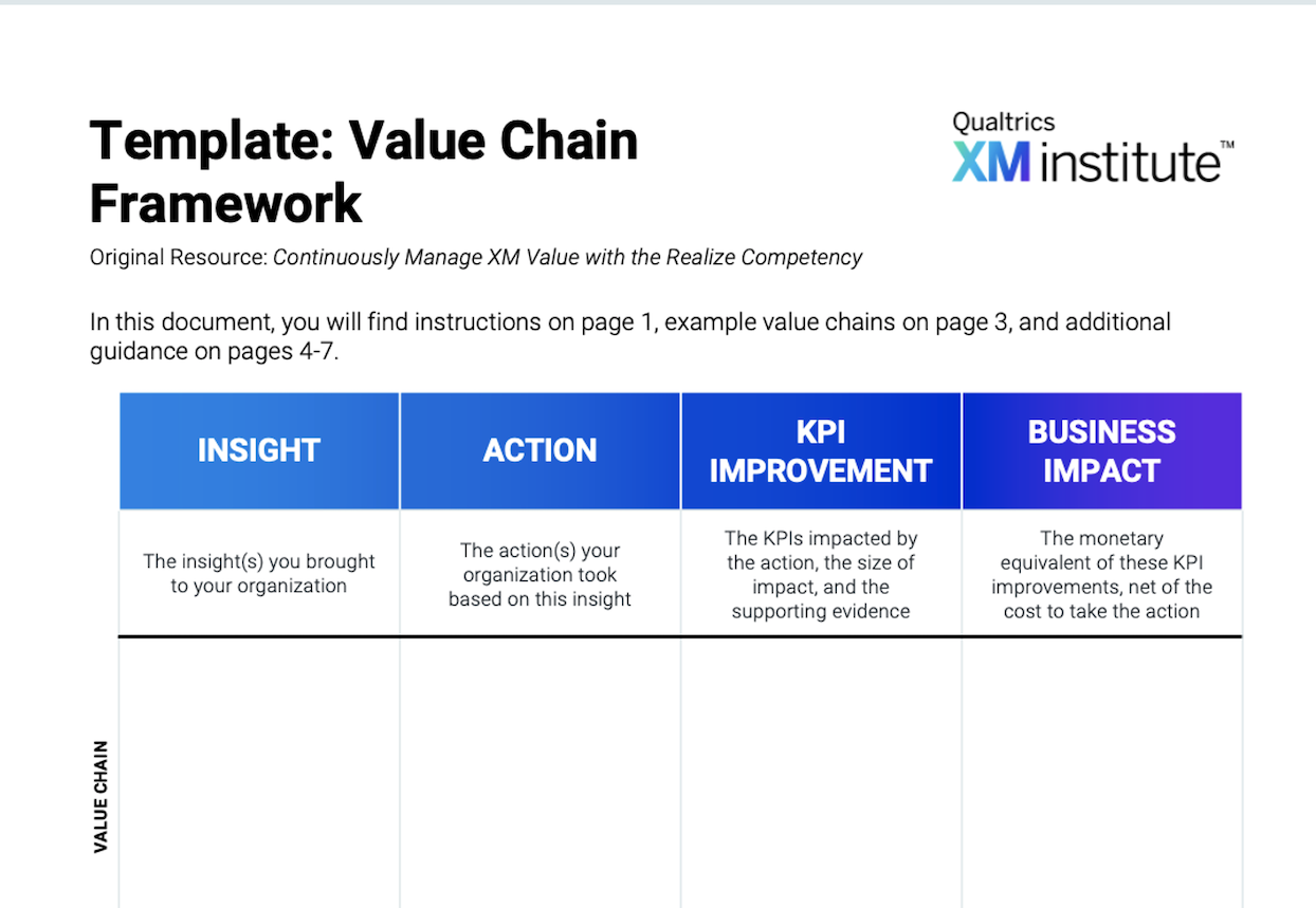
4 x 11 in Infographic